Dragon Age Inquisition

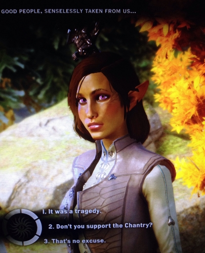
This Friday, I discovered the worst thing to ever happen to my miniature painting: 

The game launched Wednesday and by Friday it was purchased, downloaded and installed. I saw this loading screen and then I blacked out in game marathon gloriousness that lasted all weekend. I love BioWare's Dragon Age franchise. I've played each game in the series-- twice, in one case. While I've played the previous game installments on the XBOX360, I've heard repeatedly that "games just look better on the PC". Despite this, I didn't think it would be worth it to trade in my comfy couch and controller for sitting at desk with a keyboard and mouse after working all day in mostly the same position. I was wrong. It looks awesome. I took a few decent-resolution screen shots whenever I thought "Wow, this game looks amazing!" (click on the images below to zoom in). Embarrassingly enough, the rest of these pictures were taken with my phone. 

Without further ado, may I introduce Mocha the Mage! A female Dalish Elf in my standard Philippine princess build, with purple eyes to boot. I love her. 

Getting started in the PC version there were a few weird quirks, like the default mesh setting causing everyone to look as if they were made out of shiny plastic. After a few adjustments (and a few crashes), I was off and playing my style of OCD-completionist-gaming where I pick up every single thing along the way. I resurfaced for food many hours later and when I came back, I wanted to play through the opening sequence without the weird mesh glitch. So I decided to make a new character-- this time a male human rogue who I've named "Mr Smolder". Mm, pretty boy goodness. 

When I replay this game in the future (because I will), I'll enjoy choosing different dialogue options and opening alternate plot paths as this guy. In the meantime, Mocha's currently Level 7. I am enjoying the Mage class so far, and I noticed several changes that BioWare made in their newest creation. While I still have a long way to go in the game, I had these initial reactions that I thought I'd share here:

3 Wins:

Armor. In the most recent Dragon Age II, the player was unable to customize armor for their companion characters. I found that fairly frustrating, and I like to see different armor designs and styles on characters. However, in Dragon Age Inquisition, I'm able to change the look & feel of each character again. Wonderful! I also admit I've been known to wear sub-par armor if it looks just that much cooler than the armor with superior stats. 

Mounts & Fast Travel. Whether you're lazy and want to zip everywhere quickly (not including loading times, but I'm sure that will improve), or you want to gallop through the countryside on the back of a majestic Halla, DAI has you covered. I love this feature. I use both-- one to quickly return to the War Room, the other to traverse the map. (I just wish I could collect loot/herbs without having to dismount but I know that's being super-picky). 

Collectables & Open World. DAI reminds me a lot of Dragon's Dogma & The Witcher in the style of gameplay-- beautiful visual design elements, fairly open world exploration, with a strong plot line & storytelling. Add to that a healthy amount of animated cut scenes and the War Room map & specialty task force strategy concept I'm one happy camper. I would make the obvious comparison to Skyrim, but I don't think that's fair since I believe Skyrim is in a class of its own when it comes to open world exploration at the time of the game release. In the past, Dragon Age has been known to be linear, and while I appreciate the fairly clear direction in the storyline, I love to explore. In DAI, there are plenty of crafting supplies to collect, and for someone who picked every tuft of Tundra Cotton and Blue Mountain Flower in Skyrim, I can really dig that. 

3 Bummers:

Streamlined Tactics & Stats. In Dragon Age II, I enjoyed micromanaging the companions' controlled actions and their stats. When I went to customize companion behaviors (aka "Tactics") in DAI, I was somewhat disappointed. For each ability, there are only options for "Disabled", "Enabled", and "Preferred". I understand that this approach streamlines the game for most players and makes it accessible for all. Also, at this point, I'm unable to customize the Stats (Ex: Strength, Dexterity, Willpower, etc) of players as they level up. I notice that these perks are built into armor & weapons that one would equip to characters (i.e. Staff of Lightning +3 Willpower), but I'm used to more control as the characters level up. I do acknowledge the positive change in new characters starting ability trees from scratch-- that's great! I never liked adding a character to my party only to find they've been matched to my level with auto-selected ability trees. All in all, I'm trusting the game designers in the decision to streamline the Stats and incorporate it into the armor & weapon selections. However, I'd definitely like more control over the Tactics. 

Crystal collection. This is a love/hate thing for me. I have flashbacks to the anime Inuyasha when I think of the Shikon Jewel shards being scattered across the land. There were a good 50+ episodes where they hunted these down and defeated demons who had preyed upon the abnormal powers of the shards. The perfectionist in me wants to gather all of them, but I find I'm spending far too much time running all over the countryside to collect them. So distracting! Why am I even doing this again? I'm sure it has something to do with the key to what happened in the Conclave & I'm sure it's somewhere in my Codex. If it is optional, I may leave that for the second play-through since I'd like to progress the storyline sometime in the next year. 

Valuables. It's petty, but I'm highly annoyed by the concept of moving sell loot/trash into the "Valuables" section of my inventory in order to sell it. I do believe the research items belong in the Valuables section. However, the trash does not. I'd appreciate a separate Trash or Junk section for the sell loot like in previous game versions. Other than that, I'm just glad they distinguish them visually so I double check them before I sell items individually. (Hint: never "Sell All" before visually separating them. Research = yellow background. Sell loot = blue background). Again, it's a minor complaint when compared to the rest of this beautiful game. 

Final thoughts

I love this game. In fact, I'm going to go play it again now. I'll paint at some point but right now I'm going to get lost in some DAI gloriousness. Get ready!

Projects Galore

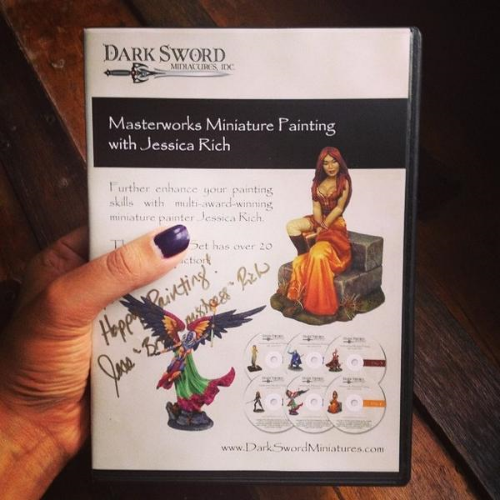
Happy Miniature Monday! So much has happened since last Thursday. Wednesday night I became ill and suffered chills, body aches, exhaustion, etc. I felt like I got hit by a truck and had to take the next two days off from work. On Thursday afternoon, I was lying on the couch miserable, when the Dark Sword Masterworks DVD set featuring Jessica Rich arrived in the mail. Perfect! Watched Discs 1-3 while I was stuck in bed sick. More thoughts about what I learned as soon as I finish the set of 6 DVDs (approx. 20 hours). She's one of my favorite miniature painters and I've been blazing through it so far!

I also backed the Dark Sword Kickstarter featuring the artwork of Stephanie Pui-Mun Law, an accomplished fantasy artist. Check out her prolific body of work here. I think her whimsical illustrations really tell a story within the world she creates; one can really get lost in those beautiful, painterly images. As of today, there are 5 days left in the project. The Dark Sword interpretations are absolutely stunning. I can't wait to own this new line of Dark Sword miniatures-- Patrick Keith did an excellent job with the sculpts! 

As far as actual painting goes, once I was feeling better, I did some work on Tish & Drak, both from the Reaper Bonesylvanians line. Both are coming along and I hope to have Work In Progress pictures of them soon!

I also finally, finally finished Lord Ironraven. This poor Reaper mini sat on my Shelf of Shame for years before I mustered the courage to paint the swath of silky cloth & large amount of metal armor. I practiced my TMM (True Metallic Metal) techniques on him and even attempted to paint some scratches on parts of his armor. I'm happy to report that he's finally based and no longer a member of the Shelf of Shame, where unpainted or partially painted miniatures await completion. 

I also find that metallic paint is especially hard to photograph. I tried two different backgrounds to try and photograph the miniature without washing out his face while trying to capture the metal highlights. It's not perfect, but I'll figure it out eventually!

Lastly, I was able to take somewhat decent (but not great) pictures of my vampire miniature. I'd like to make a few changes & touch ups to this miniature, but he too can join the ranks of finished miniatures. Huzzah!

...which reminds me: Only one more week to finish Jen from Hasslefree miniatures for the next #speedpaintchallenge! Better get to work on her tomorrow-- even if it's just cleaning and priming. I better have something to show on Thursday or else I'll be rushing at the very end. While it's four-hours-or-less speed paint, it's never a good idea to paint when rushed. I'll have to make some time for her this week. Hopefully I'll have a WIP photo or two to show in my blog Thursday post. Until then!

Reaper Artist Conference Day 1

Thanks to a series of fortunate circumstances I was able to attend the Reaper Artist Conference (RAC) in Denton, Texas this weekend. I'm splitting my adventure into two parts & I'll share my experiences on Day 2 in my Thursday blog post. So many great experiences and new ideas floating around in my head, it's hard to know where to start! 

On Saturday morning, as I made my way to Reaper HQ Saturday morning in nervous anticipation, I enjoyed a beautiful sunrise and the promise of a beautiful day (not that I'd need to spend much time outside!) 

The Reaper staff was there bright & early and the space was decked out in Halloween-themed decorations. I'm happy to say that I was able to work in several great classes both days! First up was Jennifer Greenwald's "Painting Modern Figures". I admit, my Chronoscope miniatures are the most unloved miniatures sitting on my "Shelf of Shame", a term I learned at RAC. While the figures are sculpted well, painting modern things is considerably more challenging than painting, for example, an imaginative magic staff on a figure clearly based in fantasy. Painting denim needs to be convincing, since people see it on a daily basis. Jennifer gave me some great ideas & tips for adding interest to simpler sculpt with lots of surface area to play with. Here are a few of her miniatures she passed around to the class-- I look forward to trying her ideas including painting a striped, cracked pavement base.

After that, I took a break for sustenance! Found a great little sushi place down the street where I was able to meet up with some family for lunch. Cue the gratuitous pictures of food!

Next up, Shaded Metallics with Michael Proctor! I had the pleasure of meeting Michael at this past ReaperCon where I was first introduced to his style & use of dynamic colors. After trying my hand at the NMM (Non Metallic Metal) technique, I decided that there's just as much value in painting with metallic metals, as long as you approach it in the right way. I've attempted a few TMM (True Metallic Metal) miniatures, though I couldn't seem to produce the desired effect that I wanted. His class opened my eyes to incorporating color glazes and shading applications to creating different types of metal effects. While I love taking these classes, I find it most rewarding to watch painters paint, see what they use & exactly how they use it. Here's a picture of Michael's workspace during his demo (taken with his permission of course).

This was a paint-along class and my demo miniature turned out better than expected. I tried techniques in both silver-steel & gold-bronze. Can't wait to apply my new knowledge to miniatures with lots of sculpted armor!

Last but not least was Derek Schubert's "Painting Monochrome", where I excitedly took notes on how to identify certain values and assign those values to different textures and surfaces. Derek is one of my favorite painters and I was so happy have some one-on-one time with him at the last ReaperCon. His intelligent & practical approach to painting really resonates with me. As he explained in his class, when painting monochrome, one isn't distracted by colors and can focus on assigning light & dark values to achieve high contrast in their miniature. Of course, those same techniques can be applied to colorful miniatures as well. I can't wait to try painting a sepia-toned miniature with lots of different textures.

On a side note, while recording instructors is understandably prohibited at these events (and taking photographs of them without their permission is quite rude), I focus on taking an appropriate, if not a bit blurry, picture of the table. Here, Derek brought some example minis & source materials during his class to show & share. I'm not sure why this picture makes me smile so much but it does! Maybe it's the photo of Sean Lennon and his thoughtful expression that seems to say, "Hrm, yes, it's true. Painting in monochrome is never boring."

One photo I didn't get was of my own miniature in the Halloween painting contest. Since traveling to Denton, Texas was a bit rushed, I don't have a picture of my own mini! I hope to have one as soon as I'm back. While I'll have more information & pictures about the painting contest to share on Thursday, I can let you in on a secret and tell you my great experience at RAC may have been made even sweeter after these guys were involved...

See you Thursday!