Greaves Lightning!

Go, Greaves Lightnin'
You're burnin' up the quarter mile
Greaves Lightnin', go Greaves Lightnin'...

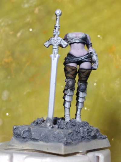
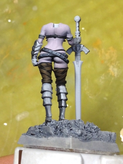
I had John Travolta and "Greased Lightning" stuck in my head as I painted Bailey's greaves yesterday. I've started saying "greaves" now since I had to Google "metal shin guards" and realized they have a name-- I needed to brush up on my knowledge of armor! Here's a wonderful reference I found that may help you too:

I haven't painted on Bailey since June 8 and I've been in a serious creative funk. Now that I finally have my desk back and the construction repairs should be completed today, I powered-through my apathy. I downloaded a new audio book, prepped my brand new palette and refused to leave my chair until her greaves were painted. Here's where I left off:

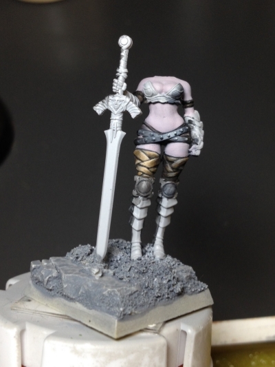
I researched a few metal greaves online and found a few not-too-shiny green-gold references I could use. I also tried to imagine where the light would fall within the concept of zenithal lighting. While this diffused, overhead lighting angle doesn't work for everything (especially realistic lighting techniques like other-source-lighting and hyper-realistic NMM), I'm practicing painting NMM one step at a time starting with the basics. Here are some of the references I found online that helped me imagine how light would reflect off different metals-- so far, Bailey's metal matches Antique Brass the best!

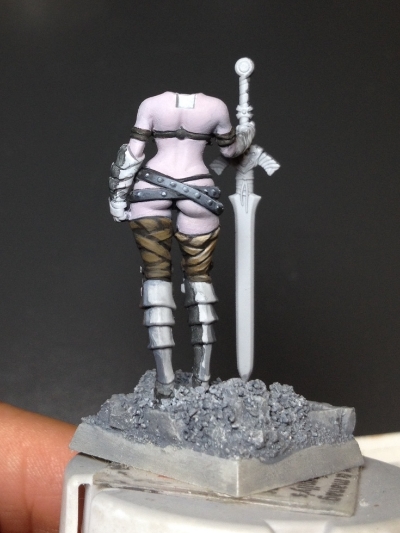
Putting all of this information together, and adding an extra touch of high-contrast in the corners as a stylistic choice, she turned out pretty well considering my current skill level. I painted up her boots and bodice leathers. Now I can finally attach her arm and start painting her gloves and weapons-- last but not least will be her cloak!

...Greaves Lightning! Go! Go! Go! Go-go-go-go-go... 

Can't Argue With Contrast!

Have you ever heard "You could really use some more contrast on the  ____"? Yeah, me too. It's a horrible shouty-voice in my head that keeps pushing me to paint my shadows darker and my highlights lighter. I can't argue with the results, but it takes quite a while to blend smoothly. I'll get faster, but I need to focus on "seeing" how to incorporate more contrast in my figures. Previously, I'd see a model and think "Wow, that really 'pops'! How did they do that?" Now I understand that it's really about high contrast and using a wide range of dark & light values. While there's something to be said for being true to textures (for example, rugged leather won't contain nearly as many different values as a reflective silk), I want to experiment a little more. I decided to do a side-by-side comparison just to see how much I could push things visually. 

Here are the Reaper paints I used:

  • Brown Liner
  • Olive Skin Shadow
  • Linen White

I painted the entire section of upper leg wrap in Brown Liner and then painted the individual sections with "Olive Skin Shadow" as the base coat. I went back in with Brown Liner to clean up and differentiate the wrap strips. I mixed about three progressive shades in between Olive Skin Shadow and Linen White to achieve smoother blending, continuing to push all the way up to pure Linen White for the upper edges. In the back view below, you can see a big difference between the flat base coat and liner version I started with. You can't argue with contrast!

Bailey WIP · Gold Non-Metallic Metal

I'm a fast learner. I'm also a perfectionist. If something doesn't look right, it bothers me and I can't move on until I fix it. A few nights ago I did a study in Gold Non-Metallic Metal. While I've practiced Gold NMM a few times on a lady barbarian and a Minotaur, I've never felt I've quite gotten it right. I've always wanted a subdued, greenish-"muted gold" (in fact, it might even be classified as bronze at this point). In any case, I tried two different approaches recently:

  • Start with the darkest color and highlight up from there, using a less-colorful, more realistic color scheme. 
  • Start with second-brightest highlight and shade down. Use a colorful, fantasy-inspired yellow-orange palette. 

After writing about my Miniatures from 2014 and seeing how far I've come in the past year, I wanted to select a mini that I've painted before to see the difference in skill level. I chose one of my favorite Reaper sculpts from Werner Klocke, Bailey Silverbell. I painted her in 2012-- Bailey was the second miniature I ever painted. I love this sculpt and I wanted to try some challenging techniques this time around. Focusing on what I learned from my Gold NMM studies, here's what I came up with after painting the armor sections on each hip:

I even added a small dent in a section of the armor to give it some additional interest. However, after studying the images I posted to Twitter, I realized one side looks much better than the other-- the colorful version like she's wearing a breakfast pancake on her hip and I didn't paint nearly enough contrast to make it look like convincing NMM. I've seen some beautiful colorful NMM before, but after this study, I decided I like the worn, hammered metal armor look. Since I wanted the armor to match the better result, I painted over the "pancake" armor to make it consistent with the other section of armor.

After that, I started painting her knee and shoulder guards using the same approach. While the blending took a considerable amount of time, I'm extremely happy with the results. I've never been happy with NMM like this and I'm so pleased to have results I'm proud of! Her cloak is still only in the base coat phase and I'll still need to paint highlights on her bodice leathers-- she's only 30-40% complete, and it's about time to attach her right arm that holds a dagger. Plenty more to paint on this miniature!